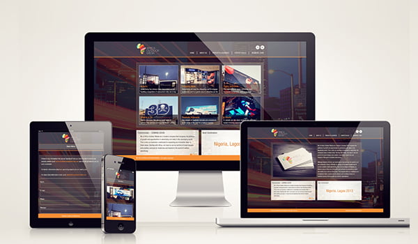
Responsive web design service can be well expressed as the most diversified activity with multiple variation in styles and qualities. One of the crucial factors of achievement in Responsive design is creativity and best ability to design a most attractive site for both mobile users and desktop users.
In these days of smart phone era, the mobile users have been participated in hiking the traffic of websites with several clicks. They can do this click activity at any times such as leisure moment, travelling, etc. Google also has been giving preferences to responsive websites in ranking algorithms calculations.
We are going to narrate below some useful Tips about how to start with Responsive Web design Services.
1. Initiate with analysis on mobile users
Analyze deeply on mobile users and their way of interaction with various mobile platforms such as Android, iPhone, Windows phone etc. You might have maximum end user issues and utilities throughout this analysis. The screen size and quality of the web design must be justified accordingly.
2. Expertise with Analytic survey:
Through out proper analytics survey, detect the most needy area or frequent accessing area of your website by mobile users. For example: home page with mobile/telephone numbers, search bar, contact -us form, etc. These most visiting parts of website needs to be displayed to the mobile users at the 1st moment of browsing websites.
3. Appropriate Media queries Implementation:
One of the important feature of CSS3 is “Media query”, which enable content for responding various criteria on any specific device such as graphics resolution, size, orientation of the mobile screen. The CSS rule of Responsive design will be automatically enhanced the quality of the website, in order to satisfy the user’s visual need.
4. Browsing speed enhancement:
Browsing speed of responsive websites is the main interest of users. It should be maximized by including optimized/Adaptive images. Eliminate the garbage to raise the browsing speed of website. Best loading time of website is expected to be 3-4 second.
5. Fluid Grid utility:
The integration of “Fluid grid” is one of the toughest parts of design activity. Both Fluid grid and Media queries function together towards various mobile systems. Here, design is done on percentage basis for different sizes of view ports.
6. Use of hidden menu and right button size for mobile users
For the enjoyment of the Responsive website display on mobile, the proper menu style should be implemented. One of the popular menu is “Hamburger menu” which contains hidden menu. It reduces frustration of user for navigating required pages.
Instead of small button sizes, you need to use buttons of 44 * 44 PX for comfortable pressing. Also padding can be used in the place of margins. Padding increases the key pressing area, but margins are unable to do the same.
After all above implementations, the Display screen orientation is the final requirement before launching the Responsive website to the domain server. The default screen orientation should be Landscape to give a better view than portrait view around 50% more size.
Related Posts...
Mobile AppsTechnologiesWeb DesignWhat is New!What's Hot
Apr 18th, 2024
Your corporate website is a critical component in shaping perception of your brand. Discover how elements like design, content, and UX influence how customers view your company. We break down key strategies to align your site with your brand identity.
Read more
Apr 16th, 2024
Can EduTech Apps recreate an in-person classroom experience for remote learners? Find out how these apps are enhancing remote education in this insightful post.
Read more
Apr 11th, 2024
Discover how Singsys’ expertise in website development can help your business succeed with responsive and intuitive websites. Enhance user experience and boost conversions today!
Read more